Omada by TP-Link launches new Fusion Gateway line
Omada, TP-Link’s dedicated business solutions brand, has announced the launch of its Fusion Gateway product line, designed to simplify setup,…
Leading real hands on tech review site in Ireland with technology, business news and more. Jim O Brien Tech.

Omada, TP-Link’s dedicated business solutions brand, has announced the launch of its Fusion Gateway product line, designed to simplify setup,…
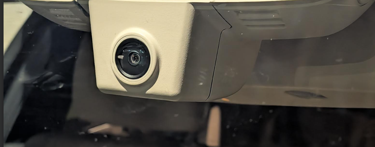
The Fitcamx Dash Cam for Mercedes-Benz is a simple to use and install dashcam for everyone in this instance as…

TechBuzzIreland readers see new gadgets, apps, and services land every week. For a small shop, that pace creates a simple…

The Google Home Speaker comes with Gemini for Home voice assistant, which features advanced natural language understanding and reasoning. Instead…

Marketers obsess over the click. Rightfully so, to a point. The headline gets tested. The bid strategy gets refined. The…

In modern workplaces, professionals are using digital tools and platforms to communicate, share, and co-create with colleagues, clients and partners,…

Crave have a new line-up of cases to protect your iPhone 17 Pro with the Crave Dual Guard Case ina…

Technology has quietly become one of the driving forces behind modern online casino gaming experiences. Behind the scenes, a range…

If your charger feels slow, your power bank no longer lasts the day, or your desk is crowded with too…