Buying gadgets online is brilliant right up until the box arrives and the thing inside isn’t quite what you pictured. The speaker that looked neat and compact turns out to be the size of a shoebox. The “slim” charger is a chunky brick. The ports you assumed were on the back are actually crammed onto one awkward side. A handful of product photos and a spec sheet get you most of the way there, but they leave real gaps — and those gaps are exactly where buying mistakes happen. This is where richer, interactive product visuals earn their keep.
Specs tell only part of the story
Specs matter, obviously. Dimensions, battery life, port types, wireless standards — you want all of it. But a list of numbers doesn’t tell you how a device actually feels or fits into your day. “67 × 149 mm” means very little until the phone’s in your hand; a speaker’s wattage says nothing about whether it’ll look right on your shelf.
That gap between the spec sheet and the real object is the problem online shopping has to solve. Earbuds, a smart home hub, a webcam, a desk charger — each of these can read completely differently in person than on a stat line. The buyers who end up happiest are usually the ones who got a proper sense of the physical product before ordering, not just its measurements.
Why the angles matter
One front-on hero shot is where most product pages stop, and it’s the least useful view for actually understanding a device. What you want are the angles the marketing shot skips.
A side view tells you how thick something really is. A rear shot shows where the ports and the buttons live. A close-up on the bottom edge reveals the charging connector, the vents, the rubber feet. When a product page includes multiple angles, close-ups, or a 360-degree view, shoppers can better understand the build, ports, buttons, and proportions; resources such as cgifurniture.com/service/360-product-spin-services/ show how this type of product presentation can be created for online retail. Being able to spin a gadget around and look at it from every side answers the small practical questions — will that port fit my cable, does the stand fold flat, which side is the volume rocker on — before the thing ever ships.
Unboxings and product videos still matter
A still image freezes a product; a video shows it doing its thing, which is why unboxings remain one of the most useful formats in tech. They answer the questions photos can’t.
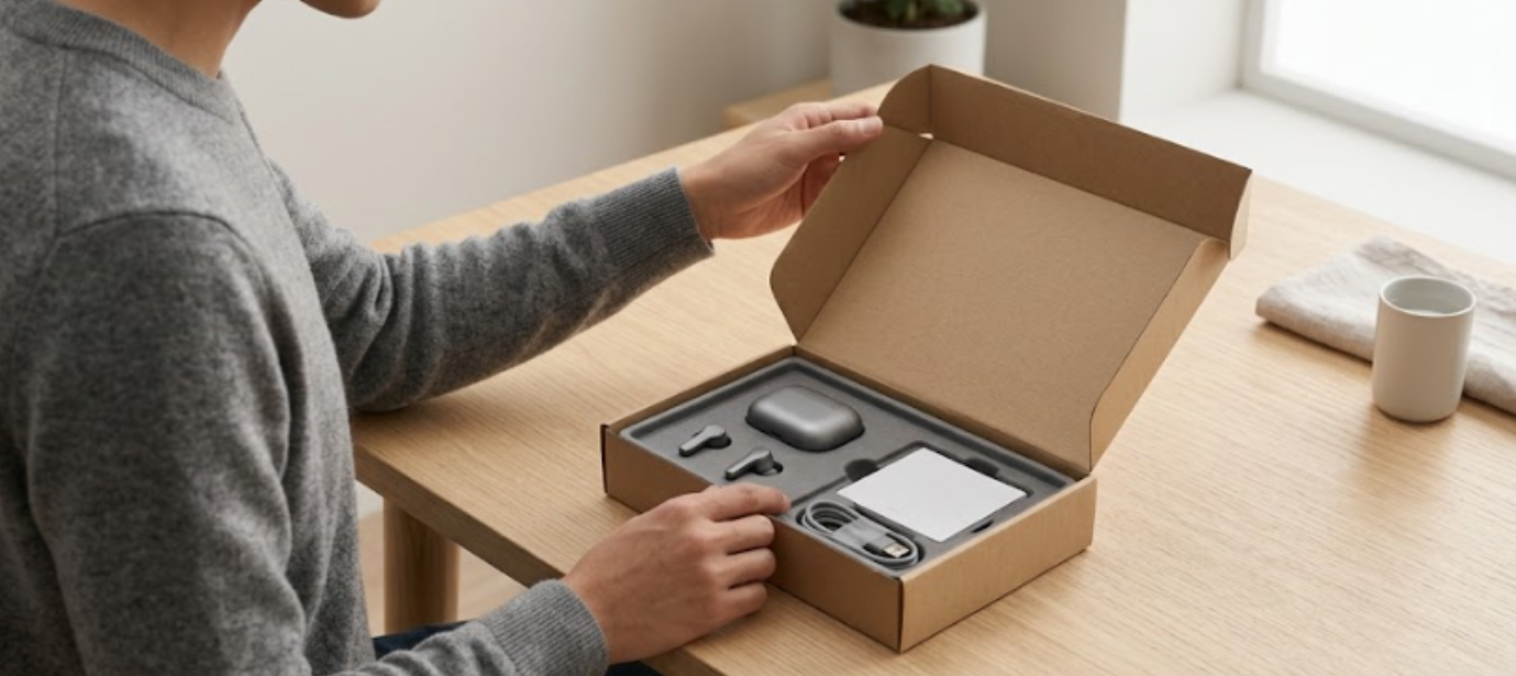
An unboxing shows you what’s actually in the box — the cables included, the adapters, whether you’ll need to buy a charger separately. It gives you a real sense of scale when someone holds the device in an ordinary hand. And it walks through setup, which for a lot of gear is where the frustration hides. Watching someone unbox and set up a smart display or a pair of earbuds tells you in two minutes what a spec table never will: how big it really is, how fiddly it is to get going, and what you’re genuinely getting for your money.
Smart home gear needs extra context
Smart home devices are the category where good visuals matter most, because you’re not just buying a gadget — you’re putting it into a specific spot in your home. A sensor, a hub, a smart bulb, a video doorbell: how it looks and mounts is half the decision.
So the questions get physical. How does it attach to the wall? Is there a trailing cable, or is it battery-powered? How big is it next to a light switch? Will the little status light glare across a dark bedroom? A photo of the device in a real room, plus clear shots of the mounting and the cabling, answers the things buyers of smart home kit actually worry about — the stuff that determines whether it looks tidy on your wall or like an afterthought bolted next to the door.
Close-ups help you judge build quality
You can’t feel a product through a screen, so close-ups are the next best thing for working out whether something’s well made or cheap. A front-facing photo hides all the tells; a detail shot gives them away.
Zoom in and you learn a lot. The texture of the finish — is that aluminium or painted plastic? The gap around a hinge. The quality of the speaker grille, the bezels around a screen, the connectors, even the cable that comes in the box. Good close-ups let a buyer spot the difference between a device that feels premium and one that photographs well and disappoints in the hand. For anything where build quality is part of the appeal, those detail shots do more selling than any spec.
Better visuals mean fewer surprises
None of this is about making products look prettier. It’s about helping a buyer understand what’s coming before it lands on the doorstep. When a page gives you the angles, the close-ups, a video, and a way to see the thing from every side, you catch the size, shape, and compatibility issues early — while they’re still a reason to reconsider rather than a reason to start a return.
And that’s the real value, because sending tech back is a hassle nobody wants. The more accurately a product page represents the device, the fewer nasty surprises after delivery, and the more confident the whole purchase feels. Better information upfront simply makes for better buying decisions.
Final thoughts
Online tech shopping works best when everything pulls together — the specs, the reviews, the photos, the videos, and the interactive views all filling in different parts of the picture. No single one of them tells the whole story, but together they let you understand a gadget properly before you commit. The aim was never to make products look better than they are. It’s to help you know exactly what you’re buying, so what turns up is the thing you were expecting.