Skip to content

techbuzzireland.com

Leading real hands on tech review site in Ireland with technology, business news and more. Jim O Brien Tech.

Tag: logo

5 Ways Small Businesses Can Improve Their Packaging

5 Ways Small Businesses Can Improve Their Packaging

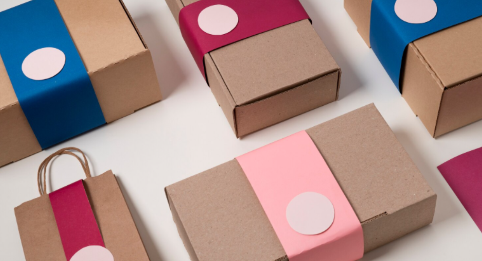
Packaging is more than just a way to hold a product. For small businesses, it’s a chance to protect items, attract customers, and strengthen your brand. Good packaging doesn’t need to be expensive, but it should be practical and thoughtful. Here are five effective ways small businesses can improve their packaging and make a lasting impression.

1. Focus on Product Protection

The main purpose of packaging is to keep your products safe. Receiving a damaged item can quickly turn a customer away. For small businesses, this also means fewer returns and happier reviews. Using sturdy boxes, bubble wrap, or foam inserts can prevent breakage during shipping. Even small details, like sealing edges well or adding cardboard corners, can make a big difference. Consider how your product travels and make sure the packaging can handle bumps and drops.

2. Keep it Simple and Practical

Sometimes less is more. Simple, practical packaging often works better than over-complicated designs. Customers like packaging that’s easy to open and, ideally, reusable. Avoid unnecessary layers or materials that don’t add value. For example, a neat box or a slim sleeve with your logo can look professional without being wasteful. Size matters too—oversized boxes can increase shipping costs and create a clumsy appearance.

3. Use Eco-Friendly Options

Sustainability is increasingly important for shoppers. Using eco-friendly packaging shows that your business cares about the environment. Paper bags are a popular choice—they’re biodegradable, reusable, and easy to customise with your logo. Other green options include recycled cardboard, compostable wraps, or minimal use of plastic. Eco-friendly packaging can also become a selling point, as many customers prefer to buy from businesses that care about the planet.

4. Enhance Branding Through Packaging

Packaging is a great way to reflect your brand identity. Your logo, colours, or even a small tagline can make a difference. Personalised stickers or thank-you notes inside the package help customers feel appreciated. Even the choice of materials can reflect your brand personality—luxury brands often use textured boxes, while playful brands might use bright colours and fun patterns. Consistent branding across your packaging builds recognition and trust over time.

5. Pay Attention to Presentation

Presentation can make a small but meaningful difference. How a customer opens a product can leave a lasting impression. Little touches like tissue paper, ribbon, or neatly folded packaging show care and quality. Presentation doesn’t need to be expensive; even simple, clean layouts with thoughtful placement can impress. Unboxing experiences are often shared on social media, giving your business free exposure. If you’re looking for reliable packaging supplies to improve presentation, websites like bestbuyenvelopes offer a variety of high-quality options suitable for small businesses.

Conclusion

Improving packaging is an investment in both customer satisfaction and brand image. By focusing on protection, simplicity, eco-friendliness, branding, and presentation, small businesses can make their products stand out. Even small changes, like switching to paper bags or adding a personalised note, can make a big difference. With the right supplies and attention to detail, your packaging can help create a memorable experience that keeps customers coming back.

Share this:

  • Tweet
  • Email a link to a friend (Opens in new window) Email
  • Share on Mastodon (Opens in new window) Mastodon
  • Share on Bluesky (Opens in new window) Bluesky
  • Share on Reddit (Opens in new window) Reddit
Posted on January 8, 2026Author Jim O Brien/CEOCategories BusinessTags #packaging, #protection, branding, Business, Clean, eco-friendly, high quality, layout, logo, luxury, paper bags, Practical, presentation, reliable, smallLeave a comment on 5 Ways Small Businesses Can Improve Their Packaging

Logo Trends in 2025: What AI Tells Us About the Future of Brand Identity

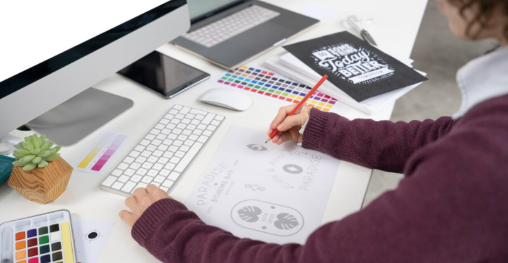
Logos have long been the visual shorthand for brand identity, but in 2025, the process behind creating them is shifting rapidly—and it’s being driven by artificial intelligence. From bold minimalism to dynamic responsiveness, new trends are emerging not just from designer studios, but from the neural networks powering AI design platforms.

So what do these tools reveal about where branding is heading?

The Minimalist Revival Continues

Flat design and minimalism are nothing new, but AI has pushed these aesthetics even further. Algorithms trained on thousands of successful logos are favoring clean geometry, sans-serif typography, and restrained palettes. These styles are scalable, versatile, and align perfectly with cross-device demands.

Expect to see more logos in 2025 that ditch heavy gradients and intricate patterns in favour of simplicity and impact.

Logos That Adapt in Real Time

Dynamic logos—those that change depending on context—are becoming mainstream thanks to AI. Brands like Spotify and Google have experimented with responsive logos that subtly animate or shift based on screen size, user mood, or data inputs. Now, smaller companies are gaining access to similar capabilities through AI-powered platforms.

This “living identity” not only captures attention—it builds emotional resonance and boosts recall.

AI-Assisted Personalization

One of the most significant shifts in branding is the democratization of design. Brands no longer need to hire expensive agencies for professional logos—AI logo makers are turning that around.

Even the free version of an AI logo maker can generate multiple unique designs from just a few inputs—like business name, color preferences, and domain—while allowing robust customization afterward. And we are just at the start, while they keep updating and expanding on their capabilities. 

Data-Driven Logo Optimization

In 2025, logos aren’t just designed—they’re refined continuously based on performance. AI tools now allow brands to A/B test logo variations across platforms and measure metrics like engagement, recognition, and emotional response. Real-world feedback loops, powered by machine learning, are helping brands tweak colors, spacing, and even icon shapes to maximize visual impact and user connection.

This iterative, analytics-backed approach transforms logos into flexible assets that grow with the brand. By integrating logo performance data into branding strategy, businesses can ensure their visual identity isn’t just trendy—it’s effective.

Emotionally Intelligent Design Gains Traction

AI is also enabling logos to tap into emotional intelligence. Through sentiment analysis and behavioral data, design platforms can suggest color palettes and shapes that evoke specific feelings—trust, excitement, calm, or urgency. This trend is especially powerful in industries like wellness, fintech, and education, where emotional connection drives loyalty.

A recent report backs this up, showing a surge in “emotion-first” design strategies where logos adapt to mood, time of day, or user journey. Brands are increasingly using flexible design systems that shift subtly based on real-time engagement—making the logo feel more alive and relatable.

Ethics and IP: Complications Ahead

However, the rapid rise in AI-generated logos brings forward ethical and copyright concerns. If multiple businesses use the same AI tool and prompts, how original are the outcomes? If AI-generated logos infringe on something else, whose responsibility is it?

The challenge lies in the way most AI systems are trained. These models analyze and learn from vast datasets of existing logos—some of which may be protected by copyright or trademarks. While AI doesn’t replicate logos verbatim, it can generate designs that resemble or echo elements of copyrighted work, sparking potential IP conflicts.


Legal experts advise caution: businesses should treat AI-generated logos as drafts—not final, exclusive assets—and refine them to ensure true distinctiveness and compliance. This often involves manual adjustments to layout, typography, or symbolism, backed by professional review and trademark vetting.

There’s also a growing concern over accountability. If a logo violates another brand’s rights, is the liability on the business, the AI provider, or the original training dataset? Currently, legal precedent places the burden on the end user—meaning brands should take extra care before launching an AI-designed identity publicly.

Ethical branding goes beyond legality. When dozens of businesses rely on similar tools and templates, the risk of visual homogenization increases. Brands may unintentionally dilute their uniqueness by deploying generic AI-generated logos, undermining the very purpose of visual identity: to stand out.

What This Means for Branding

AI isn’t replacing creativity—it’s amplifying it. Hybrid approaches, where designers use AI-generated concepts as foundations and then apply their own artistry, are emerging as the gold standard. Logos in 2025 are evolving fast—and not just visually. AI is transforming how logos are conceived, who can create them, and what they represent. The trends show a future where branding becomes more accessible, responsive, and data-informed.

Share this:

  • Tweet
  • Email a link to a friend (Opens in new window) Email
  • Share on Mastodon (Opens in new window) Mastodon
  • Share on Bluesky (Opens in new window) Bluesky
  • Share on Reddit (Opens in new window) Reddit
Posted on July 17, 2025July 17, 2025Author Jim O Brien/CEOCategories #AITags #AI, #fintech, #IP, assistance, brand, design, ethics, evoke, logo, minimalist, real time, revival, typography

Stop Scammers from banking a holiday profit

With the Bank Holiday weekend and peak holiday season now upon us, Bank of Ireland is urging consumers to take extra care when making holiday bookings to avoid accommodation scams that typically increase over summer months.

Rental and holiday accommodation scams trick people into paying rent for property that doesn’t exist or is not actually available to rent. These scams can happen throughout the year, but tend to be aimed at people booking holiday rentals abroad or in Ireland, students looking for college accommodation and people looking to rent properties to live.

To date this year, Bank of Ireland has seen an increase in the number cases of accommodation when compared to the same period last year, along with an increase in the amount of money customers are losing in the scams.

Nicola Sadlier, Head of Fraud, Bank of Ireland said: “Fraudsters don’t take time off and are always looking at ways to take your money.  Holiday scams can be devastating and costly, as you may arrive at your destination before becoming aware that it’s a scam, so it’s really important that consumers stay vigilant and Stop, Think, Check before making any accommodation payments.”

“Bank of Ireland customers who think they may have fallen for a scam should call our 24/7 freephone line on 1800 946 764 immediately. We encourage our customers to save this number in their phone, especially before they go on holiday, so they have easy access to it if they ever need it.”

To help avoid holiday heartache, Bank of Ireland is reminding consumers:


Stop:

  • Don’t let anyone make you feel rushed or pressured into making a payment.
  • Don’t click on links from social media, emails or text messages – always visit official booking websites directly.
  • Don’t be tempted move the booking off official sites – when contacting property owners on sites such as AirBnB or Booking.com, we have seen a number of cases where owners have offered discounted prices for customers to move off the site and book with them directly which later transpire to be fraudulent.


Think:

  • Is this deal too good to be true? Often it probably is – take time to confirm the offer is genuine, check reviews and prices on independent websites.
  • Are you making a secure payment on a trusted platform?  Avoid making payments by bank transfer as these often cannot be claimed back.
  • Before you make a payment, is there anything else you can do to verify the price, property and owner?


Check:

  • Check any website links – lots of fraudsters will set up websites that look authentic – always double check website links.
  • Do your research before making any purchase, especially if booking online – consider reviews, check online maps to make sure the property exists.
  • Are they members of a recognised trade association? Don’t trust a logo on the website you’re booking through; be sure to check directly.

If you do fall victim to a holiday accommodation scam, it’s important to be vigilant to re-targeting by fraudsters who may pose as a bank or booking site offering a refund.  Be sure you know who you are speaking to before giving out your bank account details and remember if it’s a genuine caller they won’t mind you taking the time to verify who they are.

For detailed advice and information on how to stay safe from all types of financial fraud, visit the Bank of Ireland’s Security Zone section of the website.

Anyone who suspects they have been a victim of fraud should contact their bank immediately so that the bank can try to stop the fraud and where possible recover funds. Bank of Ireland customers can call our 24/7 freephone line on 1800 946 764 immediately.

Share this:

  • Tweet
  • Email a link to a friend (Opens in new window) Email
  • Share on Mastodon (Opens in new window) Mastodon
  • Share on Bluesky (Opens in new window) Bluesky
  • Share on Reddit (Opens in new window) Reddit
Posted on May 29, 2025May 29, 2025Author Jim O Brien/CEOCategories ScamsTags #airbnb, #fraud, #online, #scam, bank of Ireland, booking, holiday, logo, payment

How to Design a Logo That Evokes Emotion

In the world of branding, emotions are everything. A logo isn’t just a visual mark—it’s a gateway to how people feel about your brand. The most memorable logos don’t just look appealing; they resonate on a deeper level, creating a bond that turns casual viewers into loyal customers. Think about the warmth of the Coca-Cola logo or the excitement associated with Nike’s swoosh.

Designing a logo that evokes emotion requires a thoughtful approach. This article was prepared by the experts at Turbologo, who specialize in helping brands create designs that connect on an emotional level. By understanding the psychology of design, you can ensure your logo not only catches attention but leaves a lasting impression.

How Colors Shape Emotional Responses

Color is one of the most powerful tools in a designer’s arsenal when it comes to evoking emotion. Each hue has a psychological effect that can immediately influence how people perceive your brand.

For instance, red conveys energy, passion, and excitement, making it ideal for brands that want to create a bold and dynamic impression. On the other hand, blue is often associated with trust, calmness, and reliability, which is why many tech and financial companies gravitate toward it.

The secret to using color effectively is balance. Too many colors can overwhelm the viewer, while a well-chosen palette of two or three tones can create harmony and focus.

How Turbologo Simplifies Emotional Logo Design

Choosing the right colors to evoke emotion can be challenging, especially if you’re not a design expert. This is where a tool like Turbologo becomes invaluable. Turbologo offers an intuitive platform that helps you experiment with color palettes and instantly see how they impact the mood of your logo.

With its user-friendly interface, Turbologo lets you explore professionally designed templates, customize them with a range of hues, and adjust elements like contrast and shading to perfectly align with your brand’s emotional goals. The platform also provides suggestions based on your industry and target audience, saving you time and ensuring your logo is both visually appealing and emotionally resonant.

Whether you want to convey trust, excitement, or sophistication, Turbologo makes it easy to translate those feelings into a design that connects with your audience.

The Role of Typography in Setting the Mood

Typography goes beyond readability—it carries emotional weight. The right font can make a logo feel playful, elegant, or cutting-edge. For example, a serif font like Times New Roman exudes tradition and sophistication, while a rounded sans-serif font like Poppins feels approachable and friendly.

The spacing between letters and the thickness of the lines also matter. Tighter kerning and bold strokes create a sense of urgency and strength, while more open spacing and thinner lines evoke calm and luxury.

By carefully selecting a font that aligns with your brand’s personality, you can amplify the emotional impact of your logo.

Symbols and Shapes: Visual Storytelling Made Simple

Shapes and symbols are integral to creating an emotional connection. They convey meaning instantly, often without the need for words. Circles, for example, are associated with unity and completeness, while sharp angles can suggest innovation or speed.

Consider brands like Apple or Starbucks. Their logos aren’t just symbols; they’re stories. The bitten apple represents creativity and simplicity, while the mermaid on the Starbucks logo evokes a sense of adventure and heritage.

To design a logo with emotional depth, focus on symbols that are relevant to your brand’s story. The simpler the shape, the stronger its impact.

Understanding Your Audience’s Emotional Triggers

A logo that evokes emotion isn’t just about aesthetics—it’s about understanding your audience. What feelings do you want them to associate with your brand? Comfort, excitement, trust? These emotions will shape every design decision, from colors to typography.

Think about the lifestyles and values of your target audience. For example, a health-focused brand might use earthy greens to promote feelings of wellness, while a gaming brand might opt for bold, neon colors to evoke energy and thrill.

By tailoring your design to your audience’s emotional triggers, you can create a logo that feels personal and meaningful to them.

Balancing Simplicity and Impact in Design

Simplicity is at the heart of emotional design. A cluttered logo can confuse or overwhelm, while a clean, minimalist design allows the emotional elements to shine through.

Think of the Nike swoosh or the McDonald’s golden arches—both are incredibly simple, yet they carry profound emotional weight. These logos don’t need words to communicate their message; their shapes alone are enough to evoke feelings of movement, joy, and familiarity.

When designing your logo, focus on the core emotion you want to convey and strip away any elements that don’t serve that purpose.

How to Use Contrast and Space for Emotional Appeal

Contrast and negative space are subtle yet powerful tools in logo design. High contrast can draw attention and create excitement, while balanced use of white space can evoke feelings of calm and professionalism.

For example, the FedEx logo uses negative space to create an arrow between the “E” and the “x,” symbolizing speed and precision. It’s a small detail, but it leaves a lasting impression and reinforces the brand’s core values.

Strategic use of contrast and space can guide the viewer’s emotions and make your logo more memorable.

Creating a Narrative Through Your Logo

A logo that evokes emotion tells a story. It’s not just a collection of shapes and colors—it’s a reflection of your brand’s journey and values.

To craft a narrative-driven logo, think about what makes your brand unique. Are you a family-run business with a legacy of craftsmanship? Or are you a bold startup disrupting the industry? These stories can be expressed through subtle details like vintage-inspired fonts, dynamic shapes, or even a hand-drawn aesthetic.

The story behind your logo is what makes it resonate emotionally, so make sure every design choice aligns with the narrative you want to tell.

Testing Your Logo: Do People Feel What You Want Them To?

Before finalizing your design, it’s essential to test how people respond to it. Show your logo to a diverse group of individuals and ask them what emotions it evokes.

Pay attention to their reactions:

  • Does the logo align with your intended message?
  • Are there any unintended interpretations?
  • Is it memorable and emotionally engaging?

Gathering honest feedback can help you refine your design and ensure it truly connects with your audience.

Connecting Your Logo to a Broader Brand Experience

A logo doesn’t work in isolation—it’s part of a larger branding strategy. To maximize its emotional impact, your logo should integrate seamlessly with your website, packaging, and marketing materials.

For instance, if your logo uses warm, inviting colors, those same tones should appear in your product design and social media content. Consistency across all touchpoints reinforces the emotional message of your logo and builds stronger connections with your audience.

Conclusion

Designing a logo that evokes emotion is both an art and a science. By carefully selecting colors, fonts, shapes, and storytelling elements, you can create a logo that resonates deeply with your audience. With guidance from branding experts like Turbologo, you can ensure your design not only captures attention but also builds lasting emotional connections with your customers.


Share this:

  • Tweet
  • Email a link to a friend (Opens in new window) Email
  • Share on Mastodon (Opens in new window) Mastodon
  • Share on Bluesky (Opens in new window) Bluesky
  • Share on Reddit (Opens in new window) Reddit
Posted on February 15, 2025June 4, 2025Author Jim O Brien/CEOCategories TechTags audience, brand, design, emotional, logo, turbologo, typography
Exit mobile version
%%footer%%